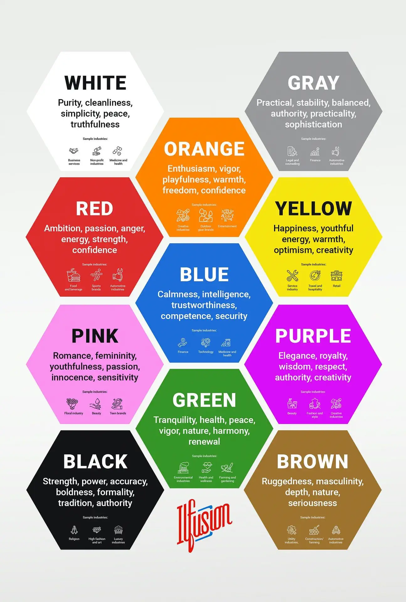
When it comes to creating a brand, one of the most important decisions to make is the choice of color. The right color can convey the desired emotion and message for your brand, while the wrong color can detract from it. In this article, we will explore the psychology of color and how it can be used to enhance the impact of your brand.
First, it is important to understand that different colors evoke different emotions in people. For example, red is often associated with energy, passion, and excitement, while blue is associated with calmness, trust, and stability. Green is associated with growth, health, and harmony, while black is associated with power, elegance, and sophistication.
When choosing a color for your brand, it is important to consider the emotions that you want to convey. For example, if your brand is focused on providing a sense of calm and relaxation, blue would be a good choice. On the other hand, if your brand is focused on energy and excitement, red would be a more appropriate choice.
In addition to considering the emotions that you want to convey, it is also important to consider the type of brand that you have. For example, if you have a luxury brand, black or silver may be a more appropriate choice. If you have a brand that focuses on health and wellness, green may be a more appropriate choice.
![]()
One example of a brand that effectively uses color is Coca-Cola. The brand uses the color red to convey energy, excitement, and passion. The red color is associated with the brand and is easily recognizable. This is one of the reasons why Coca-Cola's brand is so successful.
Another example is the brand Apple, which uses white and silver to convey a sense of elegance and sophistication. These colors are associated with the brand, and are easily recognizable.
In conclusion, choosing the right color for your brand can have a significant impact on the success of your brand. By understanding the psychology of color and considering the emotions that you want to convey, as well as the type of brand that you have, you can choose a color that will enhance the impact of your brand. Remember, each color has its own meaning and can influence the perception of the brand. Be mindful while choosing a color for your brand, it's an important step in creating a strong and recognizable brand identity.
It is also important to consider the target audience when choosing a color for your brand. Different cultures and demographics may associate different meanings with certain colors. For example, in Western cultures, white is often associated with purity and innocence, while in Eastern cultures, white is associated with death and mourning. Therefore, it is important to research and understand the cultural associations of the colors that you are considering for your brand.
Additionally, it is important to consider the use of color in relation to the competition. While it is important to choose a color that aligns with the emotions and message that you want to convey, it is also important to differentiate yourself from your competitors. By choosing a color that is unique and not commonly used in your industry, you can make your brand stand out and be more easily recognizable.
It is also important to use color consistently across all marketing materials, from website to packaging, to ensure a cohesive brand image. This will help to establish a strong brand identity and make it easier for customers to recognize and remember your brand.
In summary, choosing the right color for your brand is a crucial decision that can have a significant impact on the success of your brand. By considering the emotions that you want to convey, the type of brand that you have, the target audience, and the competition, you can choose a color that will enhance the impact of your brand and establish a strong brand identity.
In conclusion, color plays a vital role in creating a strong and recognizable brand identity. The right color can evoke the desired emotions and message while the wrong color can detract from it. It is important to consider the psychology of color, the type of brand, target audience, competition, and cultural associations while choosing a color for a brand. Remember to use color consistently across all marketing materials for a cohesive brand image. With the right color, your brand can stand out and make a lasting impression on customers.
PANEMU

Panemu is a technology-based company that specializes in developing innovative software solutions for a wide range of industries. This decision was not made lightly, as the color blue carries a variety of meanings and associations in psychology and marketing.
In psychology, the color blue is often associated with feelings of trust, reliability, and stability. These are all key characteristics that Panemu wants to convey to its customers and partners. As a technology company, Panemu is constantly pushing the boundaries of what is possible with software and is always looking for new and innovative ways to solve problems. By choosing blue as its primary color, Panemu is signaling to the world that it is a company that can be trusted to deliver on its promises and that it is a stable and reliable partner for businesses of all sizes.
In addition to its psychological associations, the color blue also has a number of other meanings in marketing. Blue is often associated with technology and innovation, making it the perfect choice for a company like Panemu that is focused on developing cutting-edge software solutions. The color blue is also associated with a sense of professionalism and expertise, which is exactly the image that Panemu wants to convey to its customers and partners.
Overall, Panemu's decision to choose blue as its primary color for its new branding is a smart move that will help the company to communicate its key messages and values to its target audience. The color blue is associated with trust, reliability, and stability, making it the perfect choice for a company that is focused on developing innovative software solutions. Furthermore, it is also associated with technology and innovation, professionalism and expertise which aligns with Panemu's vision and mission as a company.
Another benefit of using blue in branding is that it can evoke feelings of trust and security in customers. This is particularly important in the technology industry, where customers are entrusting their personal and sensitive information to companies. By using blue in its branding, Panemu is able to communicate to customers that it is a secure and trustworthy company that can be trusted with their information.
Additionally, blue can also evoke feelings of innovation and progress. This aligns well with Panemu's mission as a technology-based company that is always looking to push the boundaries of what is possible. By using blue in its branding, Panemu is able to communicate that it is a company that is constantly moving forward and breaking new ground in the technology industry.
In conclusion, Panemu's decision to incorporate blue into its branding strategy is a smart move. The color blue aligns well with the company's identity and values as a technology-based company that is dependable, innovative, and trustworthy. It also helps the company to stand out from its competitors and evoke feelings of trust, security, and progress in customers. Overall, the use of blue in Panemu's branding effectively communicates the company's message and values to its target audience.
Are you tired of feeling left behind in the ever-evolving world of business and technology? Look no further! Head on over to Panemu.com/blog for your daily dose of valuable and informative content on the latest solutions to keep your business at the forefront of innovation. Don't be a Luddite, stay ahead of the game with Panemu's blog.
